Building the User Interface
- 05 Oct 2024
- 2 Minutes to read
- Contributors


- Print
- DarkLight
Building the User Interface
- Updated on 05 Oct 2024
- 2 Minutes to read
- Contributors
- Print
- DarkLight
Article summary
Did you find this summary helpful?
Thank you for your feedback
Auto Generated UI
The Extensions UI uses the information provided in the schema to auto-determine it's UI elements, and for most simple extensions, the UI will be able to auto conform based on the bare minimum schema definition alone. However, further customization may be made in the schema for more complex or specific use cases by adjusting the layout, or adjusting the details for a specific field.
Deconstructing the Page
Generally the top of the extension page will show the extension label and it's short description. If it exists, it will also show a button for quick access to this extension's "associated sensor".
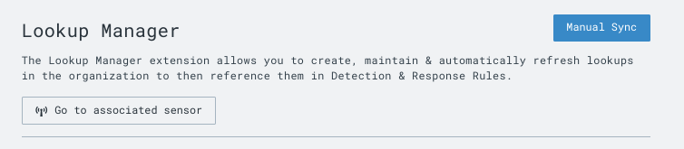
In the top right, any actions (as defined in your request schema) will be displayed as a dropdown and button.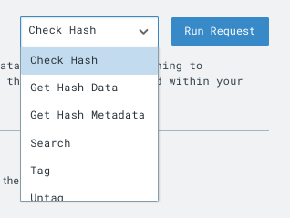
Note that there are small changes to this structure depending on the layout selected, however all variations should be intuitive as they do not deviate much from this general page structure.
Beyond this, main content of the page is determined by the layout.
Picking your Layout Type
auto(default layout, it will pick one of the below)config(use this if you have a configuration)editor(very specific use-case for editing large code blocks like yaml)action(use this to prioritize certain actions in the UI)descriptionkey(just a variation of description)
For the action, and editor layouts, make sure you define one (or more) default actions as well. The editor UI for the action layout will show all the actions in-page, as opposed to a button on the top right. When set to the editor layout, the UI will automatically run the default action and display the results and a supported action.
Form Data Types
Every field has the following optional details to further adjust the UI.
label: Add a label if you want a more 'human-legible' label on this field
placeholder: Placeholder text on the input can serve as an example for the user
description: A description for this field can be added that will be available as a tooltip on the UI next to the field label
display_index: The display index starts at 1 (not 0) and guides the GUI on the order to show the fields. A display index of 1, will display before a display index of 2.
default_value: A default value for the field, will auto-populate the field with this value
Some other configurations that conditionally apply to specific data_types:
filter: Available on select primitive data_types.
enum_values: Details on the available enums, to support the enum data type.
complex_enum_values: Details to support the complex enum data type. Supports reference links, and categories.
object: An object that contains nested key-value pairs for more fields, and serves to detail the nested fields.
For the complete list of all data types, please see the page on data types.
Nuanced Usage
If your extension requires it, there are more opportunities to adjust the UI in order to better guide or facilitate a user on using your extension.
Multiple Layouts as Tabs
In the schema, it is possible to define several views to utilize a combination of layout types. This may be useful in order to guide a user on how you want them to use your extension.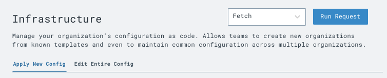
Setting Supported Actions
Functionality for this field is set to be expanded in the future
Please feel free to reach out to us on our community slack if you'd like to stay up to date on
Supported actions are tied to a request's (also called "actions") response. It allows the response data to be modified and passed along to a follow-up action. This may be useful when operating a dry run, or triggering a workflow.
Was this article helpful?